BlackWells (Bookshop): This was my final graded unit for HND Graphics, It was a self-chosen brief and I received an “A” for It. My aim was to take an existing brand and do a re-brand to spruce up the company look. I picked Blackwells as they are a well-established brand and there brand had not been updated in many years. I wanted to reinvigorate it with the hope of modernising it to match the continually evolving world we live in. I believe that reading is a fundamental skill that opens a door into a vast range of other opportunities for education and entertainment. To do this I looked into the idea of using a clever pun mixed with a matching piece of photography, with the aim of creating an intellectual visual pun. Through this I came to the Concept of ‘Between the lines’ which I have threaded through the entire rebrand.
Final Graded unit HND – A.
Self written brief.
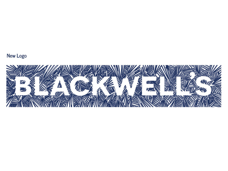
New logo, full length.
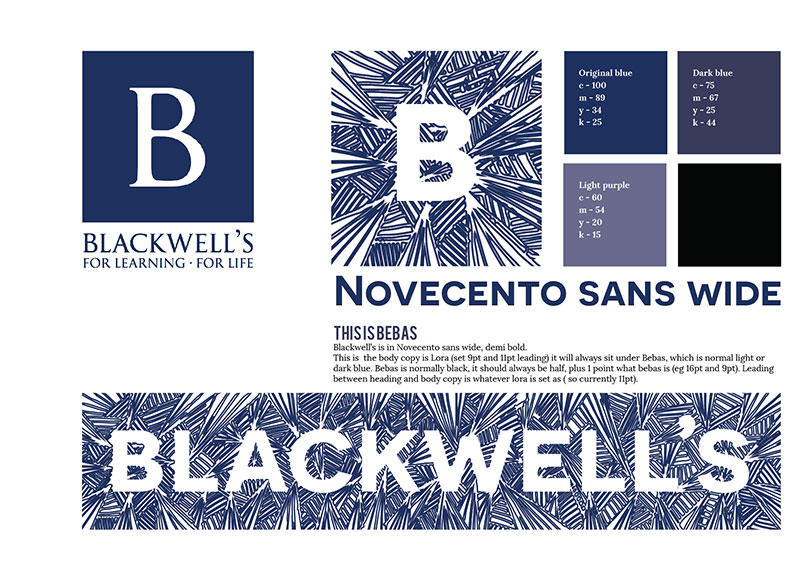
New logo, square for social media.
Concept.
Font choice and colours.
Exclusions and sizes.
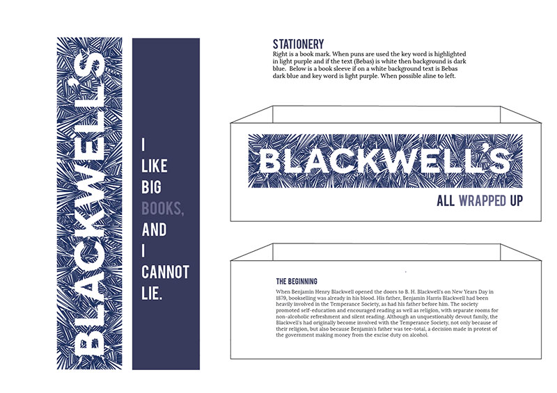
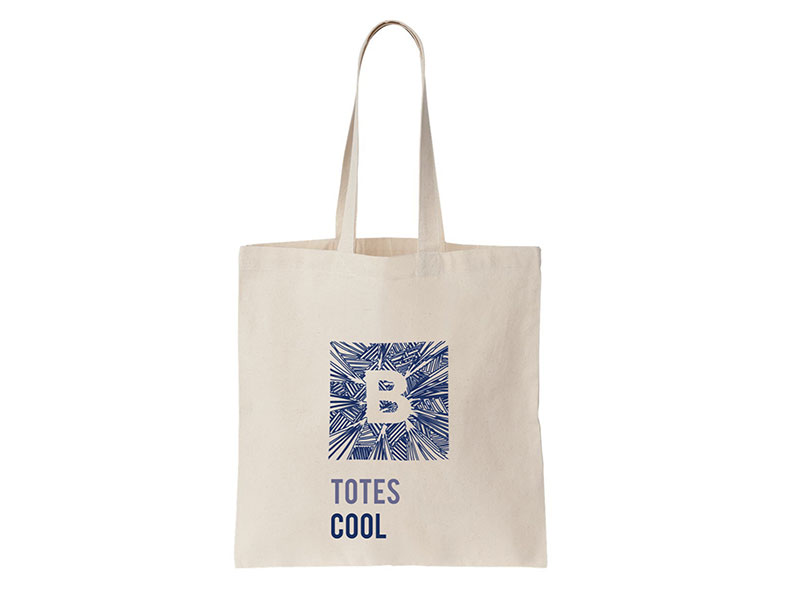
Stationery; bookmark and book sleeve.
Stationery; receipt and invoice.
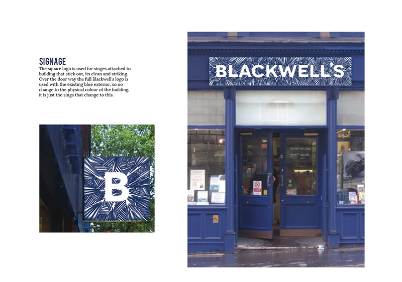
Signage, full length over the main door and square for at the side.
Social media, Twitter and Facebook.
Poster 1: “My weekend is all booked.”
Poster 2: “Don’t forget your reading glasses.”
Poster 3: “When I think about books I touch my shelf.”
Website: landing page, mac mock up.
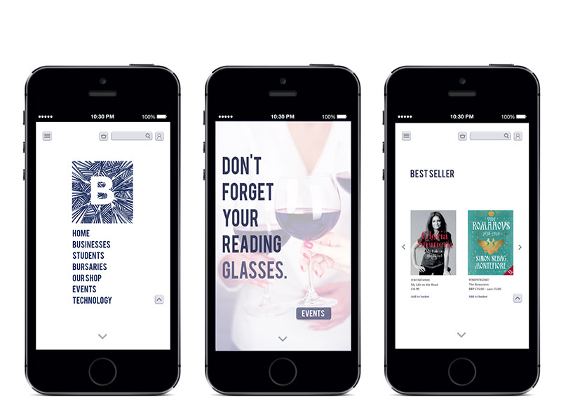
Website: landing page, menu.
Website: second page, advertising events.
Website: third page, best sellers.
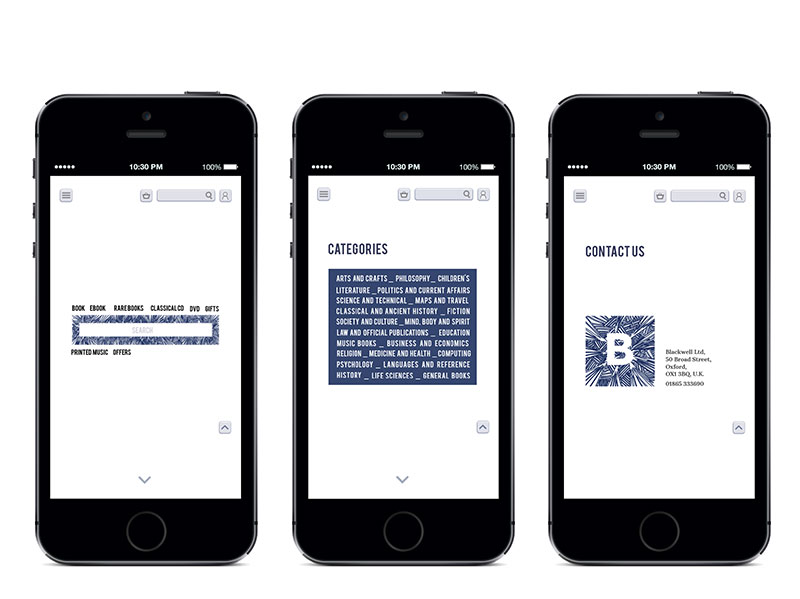
Website: forth page, search bar and sub menu.
Website: fifth page, categories.
Website: contact page, last page.
Website: on tablet and mobile.
Mobile Website: page 1-3, menu, advertising and best sellers.
Mobile website: page 4-6, search, categories and contact us.