For the graded unit of my HNC I was given the following Brief: traditional sweetshop, who are not doing as well as they used to. They want an advertising Campaign to help raise awareness of their market profile “tell everyone how great Glickman’s is”. They need to rebrand to remain competitive. Glickman’s background: The oldest Confectioner store in Glasgow, established in 1903. They are famous for their cough drops and their wide selection of sweets. Considerations: Try to bring the old traditional Confectionery shop into the 20th Century without losing their quaint charm. Let adults reminisce about the forgotten joy that sweets brought them in their childhood and show their children / grandchildren how wonderful discovering traditional sweets can be. Marketing homemade traditional confectioner has become very difficult with the twin developments of worldwide mega brands, with their associated glossy packaging and advertising, alongside the movement away from small shops to supermarkets. Concept: “Reminisce”, Tag line “remember when…” Deliverables: strong brand identity, Logo, signage, packaging (in all its forms), stationary (invoice, sweet bags and receipts), Social Media (Facebook and Instagram), website (Landing page), Trip adviser and Campaign (through bus adverts, tourist information and local advertising E.g. Metro and free newspapers).
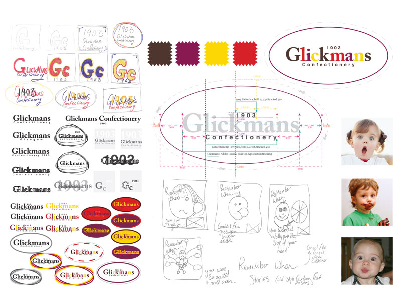
Sketchbook pages, showing research, competition and inspiration.
Consideration of font,colours and alignment, poster sketches and inspirational pictures.
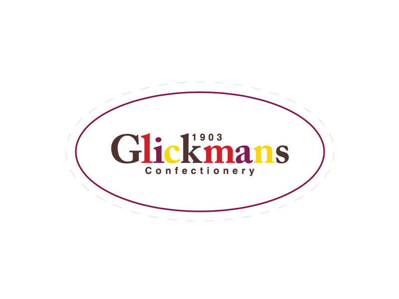
New Glickmans log0.
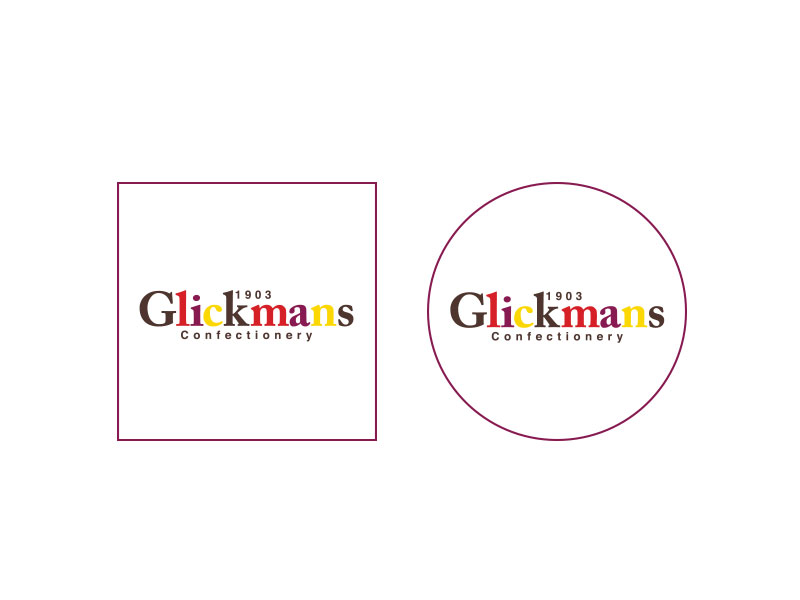
New Glickmans logo, square and circular for social media.
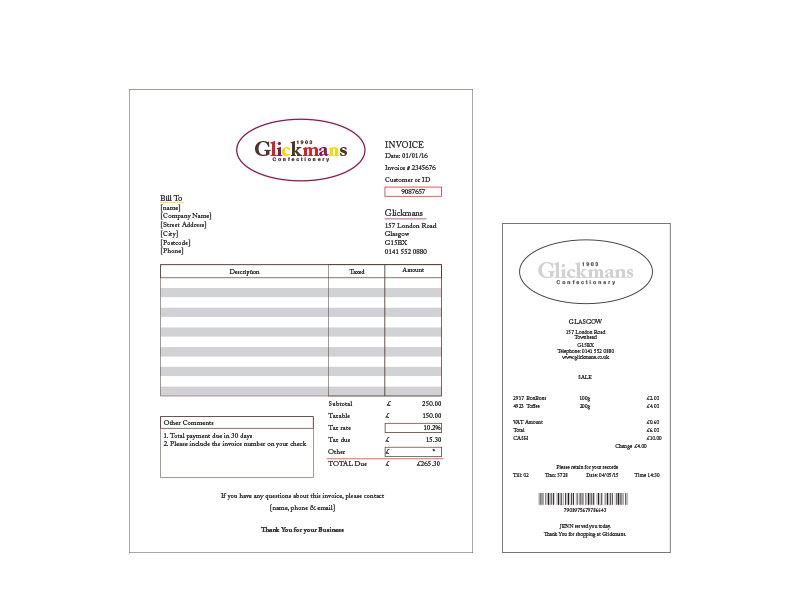
New stationery, invoice and receipt.
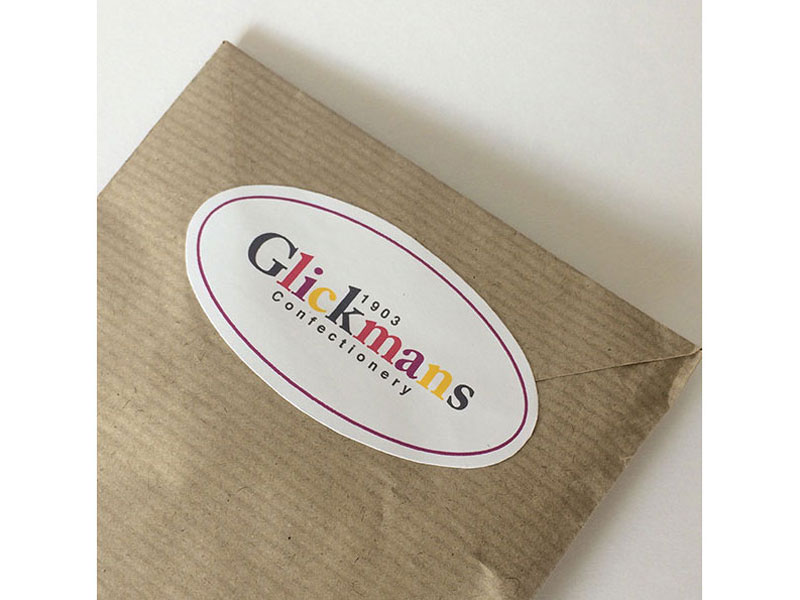
Sweet packaging, brown paper bag sealed with a oval glickmans sticker.
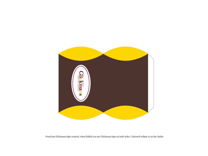
Sweet packaging, small pillow pack.
Sweet packaging, big pillow pack.
Photographs of the small brown bags.
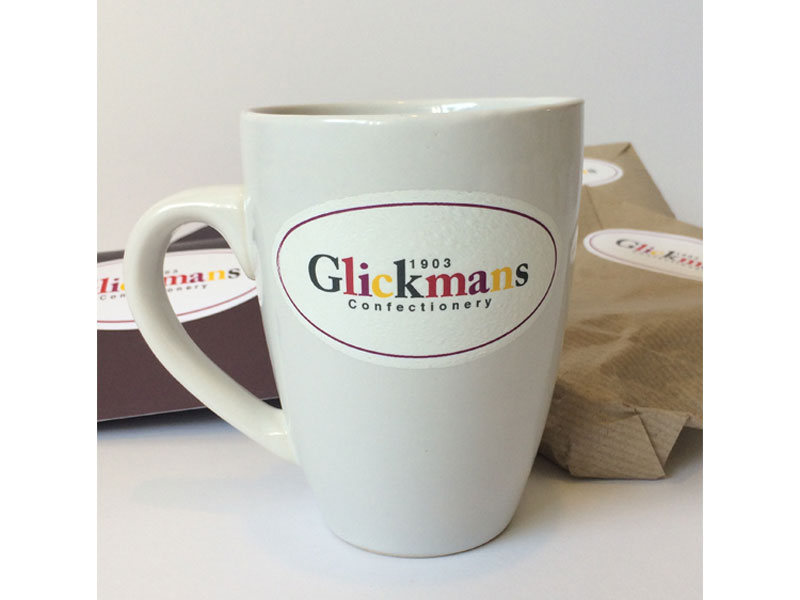
Sweetie mug (merchandising).
Zoom in on brown bag and sticker.
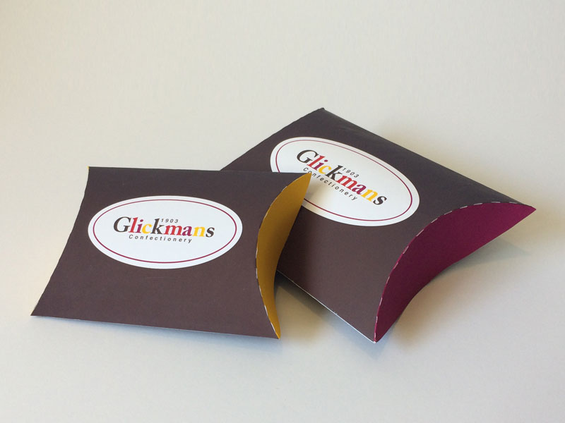
Both the pillow boxes, small and large.
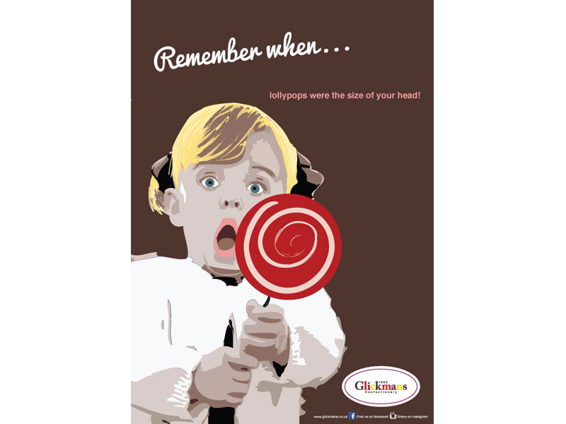
Poster 1: Remember when… lollypops were the size of your head!
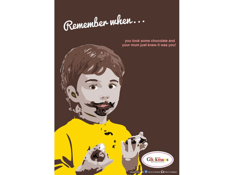
Poster 2: Remember when… you took some chocolate and your mum knew it was you!
Poster 3: Remember when… you could blow bubbles the size of your face!
Poster 1, insitu.
Poster 2, insitu.
Poster 3, insitu.
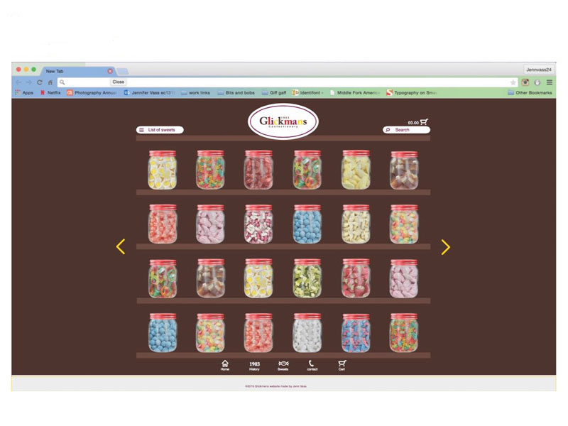
Website, front page – desktop view. I wanted it to be reminiscent and easy to use.
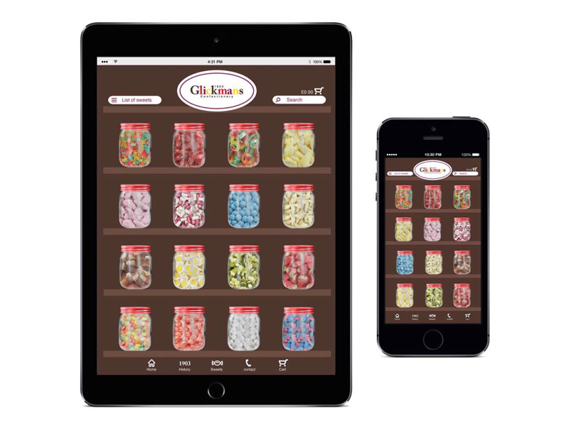
Website, front page – tablet and mobile view. Designed with touch screen in mind.
Website navigation, drop down list of sweets in top left, once you’ve selected your sweets it greys out any that aren’t relevant to your choice. When you click on a sweetie jar it brings up a pop up where you are told the price and can select the quantity then add to cart or ‘x’ out.There is more than one way to access your cart, bottom bar or at the top right where you can see your total spend
Website navigation, there is a menu bar at the bottom. ‘Home’ to home page, ‘1903’ to a pop up of the history (left picture), ‘sweets’ to a continuous scroll of all sweets, ‘phone’ to a pop up contact us (right picture) and finally ‘cart’ to take you to a pop up of your order.
Social media, instagram – this is an important tool, people love to share pictures of food and tag places and people. Having instagram helps promote / advertise the brand and connect with younger audiences.
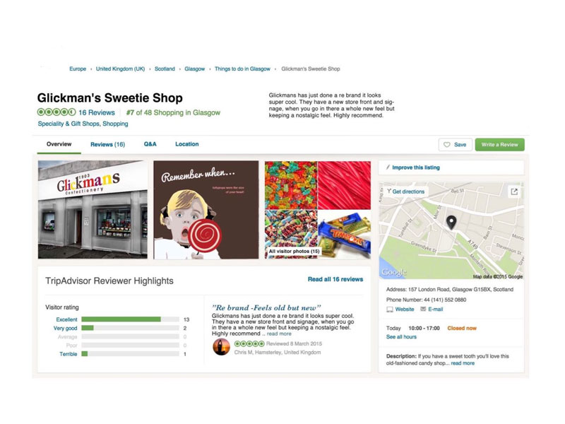
Social media, Trip adviser – many people use this to find new and interesting places when traveling. it will help connect to tourists as well as people who are looking for specialised confectionary retailers.
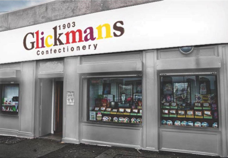
Signage, new logo and store front a nice clean neural white (instead of the green).